Thursday, May 31, 2012

Real World Bad Data: The Airlines

I hate flying.  I hate nearly everything about the entire experience really....getting to airports, the way they look, the lines, the fees, the TSA, the complete absence of food I'm not allergic to in most terminals, the boarding process, the plane itself, the proximity to other people, the feeling of being totally trapped, trying to get up and maneuver the aisles at all, and baggage claim.

Flying is terrible.

That being said, I was quite interested in reading this article that addressed why airline seats are so darn uncomfortable.  While they address the obvious issues such as increasing obesity and airline companies incentives to cram as many seats in as possible, I was struck by this quote:

In 1962, the U.S. government measured the width of the American backside in the seated position. It averaged 14 inches for men and 14.4 inches for women. Forty years later, an Air Force study directed by Robinette showed male and female butts had blown up on average to more than 15 inches.....But the American rear end isn't really the important statistic here, Robinette says.  Nor are the male hips, which the industry mistakenly used to determine seat width sometime around the 1960s, she says.
"It's the wrong dimension. The widest part of your body is your shoulders and arms. And that's much, much bigger than your hips. Several inches wider." Furthermore, she says, women actually have larger hip width on average than men.
So even back when the airlines might have made an attempt at having adequate seat size, they picked the wrong metric to play to, and everybody suffers.

I thought this was an interesting example of picking your data points.  Hip width makes intuitive sense to build a seat around, but it turns out it's wrong.

The article also has some good discussion of perception and how moving rows closer together can give you a sense the seat itself has gotten smaller.  Interesting real world applications of statistics.


Tuesday, May 29, 2012

Government benefits OR definitions and the census strike again

Last week I got a little fascinated by the census bureau data.....and this weekend I was sent an article from the Wall Street Journal regarding yet another set of Census Bureau Data that was getting passed around.

This one addressed the number of households in the US receiving "government benefits"....apparently it's up to 49.1%.

Now that's a scary number, but I am always wary of the phrase "government benefits" when it's used in a statistical context.  The problem is that it's an incredibly vague term, and can be used to cover a myriad of programs....not all of which are what initially spring to mind.  

I first learned to be wary of this term when my dear liberal brother mentioned that some group he had been following had claimed that there was some ludicrous number of government handout programs in place today.  The number struck him as high, so he got on their website and found out that they were actually counting both federal assistance programs AND tax breaks (such as home interest deductions, student loan interest deductions, dependent credits, etc) as "entitlements".  Thus in this case I am extra vigilant about my "find the definition" rule.

I took a look around the census website (we've become good friends lately) and found the list they were using as of 2008*:
  • Dept of Veteran's Affairs - Compensation, Pension, Education Assistance
  • Medicare
  • Social Security
  • Unemployment
  • Workman's Comp
  • Food Stamps
  • Free/Reduced-Price School Lunch and Breakfast Program
  • Housing Assistance
  • Federal and State Supplemental Security Income (SSI)
  • Medicaid
  • Temporary Assistance for Needy Families (TANF)
  • Supplemental Nutrition Program for Women, Infants, and Children (WIC)
Not a terribly surprising list, though I wouldn't have realized that Veteran's benefits were on there.  Even without the economy going down hill or any other expansion of programs, the Veteran's benefits most certainly would have expanded in the past few years as people continue

Additionally, it would be important to note that only one member of the household needed to receive this in order to be counted.  That struck me because my parents and my grandmother all live in the same house, which means both of my dear hard working parents are lumped in to that 49.1% number.

Whatever your feeling about government benefits, it's important to know exactly which ones are being counted in any list.  I'd imagine that many people who might dislike Medicaid might not care to eliminate Veteran's Benefits, and those who don't like TANF may very well support workman's comp.  Just something to be aware of, especially in an election year.

*To note: the latest data I could find was from 2008.  I really hate that the WSJ doesn't link to where the heck it got it's numbers.  I couldn't find the stuff they put up anywhere on the census bureau website.  I'm not doubting them, I just wonder if it would have killed them to include a link????

Time to Go Back to Work

But here's my new superhero alter ego, just for laughs:
H/T to the Assistant Village Idiot, though I think he got it from his son Ben.

It reminded me of my favorite protest sign from the Rally to Restore Sanity:

Happy Tuesday!

Sunday, May 27, 2012

Everything old is new again

One of my favorite things about growing up in the family I did, surrounded by the friends my parents had, was the large amount of historical context I was fed for nearly every topic that interested me.

People like my father (who posts here as Michael) and David (the Assistant Village Idiot) were always quick to fill me in on the history of whatever topic I happened to bring up.  This always gave me a good appreciation for the story behind the story as it were, and made me truly relish a good piece of context.  Growing up in the 80's, this was like having Wikipedia just sort of follow me around.  Come to think of it, some kids may not have appreciated that as much as I did.

I mention all this because I'm packing up my condo this weekend, and have been toting around my laptop to watch Hans Rosling's hour long documentary "The Joy of Stats" while I work.  I highly recommend this, if not for any new stats knowledge, than at least for the examples he gives and the history lesson.

One of the more interesting points he made actually related to some of my census data posts from earlier this week, so I thought I'd pass it along.

First, if you haven't read the comment from Glenn, the former Census Bureau employee, on my post about racial categorizations, you should.  He filled in some details I didn't know....I would never have guessed that it was the Office of Budget Management that set racial categories for the government....and he concludes his comments with this:

Confusing? Yes. Please keep in mind that the purpose of these categories isn't always statistical but political. Politics makes for strange statistics at times.
I liked that phrase.  I think that "The politics of statistics" should be an interdisciplinary undergrad class of some sort.

Anyway, according to Rosling's documentary, it was actually the government of Sweden that helped invent the modern study of statistics, and they began to find it so useful that other governments started using it too.  Apparently, it was not actually referred to as statistics, but instead "political arithmetic".

It is almost surreal to realize that up until that point, countries often didn't know how many residents they had, or what their biggest challenges were.  An extra bonus in the film is the map of "Bastardy in England".  Highly recommended.

Saturday, May 26, 2012

Weekend Moment of Zen 5-26-2012

Hans Rosling's enthusiasm gets me every time.  Here, he takes on the ideas of unlimited population growth and religions influence on baby making:


Apparently he has a one hour documentary on stats.  I'm adding watching it to my list of goals for the long weekend.

Friday, May 25, 2012

Watch the definitions

A quick one for a Friday:

I've blogged before about paying careful attention to the definition of words used in study results.  It is often the case that the definition used in the study/statistic may not actually match what you presume the definition is.

Eugene Volokh posted a good example of this today, when he linked to this op-ed in the Detroit Free Press.  It cites a spokesperson from the Violence Policy Center who states that "Michigan is one of 10 states in which gun deaths now outpace motor vehicle deaths".

My knee jerk reaction was that seemed high, but my tired Friday brain probably would have kept skimming.  Then I read why Volokh was posting it:
The number of accidental gun deaths in Michigan in 2009 (the most recent year reported in WISQARS) was … 12, compared to 962 accidental motor-vehicle-related deaths. 99% of the gun deaths in Michigan that year consisted of suicides (575) and homicides (495).
To be honest, I had presumed homicides were included, but suicide death didn't even occur to me.   I'd be interested to see how many of the vehicular deaths were suicides, my guess is the percentage would not be as high as in the gun case.  Either way, I'm sure I'm not the only one who didn't realize what was being counted.

Watch the definitions, and have a fabulous Memorial Day weekend!

Thursday, May 24, 2012

More census data....the minority-majority issue

I was happy to see that my post from yesterday  got an excellent comment from Glenn, a former Census Bureau employee.  He let me know that it was likely the sample they used was actually a stratified cluster sample, which is not exactly what I had surmised, but close.

As I was looking up more info on some of the Census Bureau data, I ran in to a fascinating column from Matthew Yglesias over at Slate.com.  In it, he describes his experience filling out the census form, and how his own experience made him question some of the data being released.

In specific, he questioned the recent headline that we are quickly heading towards a minority-majority society.  He mentions that as a 25% Cuban man, he looks very white, but was not sure how to answer the question regarding whether he was "Hispanic in origin".  If he wasn't sure how to answer a race question, how many others were in his boat?  He further comments that as people continue to become increasingly of mixed racial background (keeping in mind that 1 out of 12 marriages is now mixed race) it is much more likely that we will have to shift our concept of what "white" is to keep up with the times.


As Elizabeth Warren can tell you, percentage of heritage matters....but where do we draw the line?  If 3% Native American isn't enough, how much is?  I mean that quite literally.  I don't know.

In my cultural competency class in school, we had a fascinating example of racial confusion.  One of the girls I sat next too mentioned that her grandparents were from Lebanon, had immigrated to South America, her parents were both born there, married, moved to the US, and that's where she was born.  Her skin was fair, she was fluent in Spanish, and she felt she spent her life explaining that she was genetically Arabic, ethnically South American and culturally American.  I don't know what she checked off on the census, but I'm sure nothing captured that particular combination accurately.

As times change, so do our ideas of race. When reading the history of census racial classification, it's hard to disagree with Yglesias' assertion that today's racial breakdown will not be comparable to whatever breakdown we have in ten years.  That's a good thing to keep in mind when analyzing racial data.

 Racial numbers are as good as the categories we have to put them in.   

Wednesday, May 23, 2012

The (ACS) Devil and Daniel Webster

As a New Hampshire native, I am prone to liking people named Daniel Webster.

It is thus with some interest that I realized that the Florida Congressman who is sponsoring the bill to eliminate the American Community Survey happens to share a name with the famous NH statesman.  I have been following this situation since I read about it on the pretty cool Civil Statistician blog, run by a guy who runs stats for the census bureau.

Clearly there's some interesting debate going on here about data, analysis, role of the government, and the classic "good of the community vs personal liberty" debate.

I'm going to skip over most of that.

So why then, do I bring up Daniel Webster?

Well, I was intrigued by this comment from him , as reported in the NYT article on the ACS:
“We’re spending $70 per person to fill this out. That’s just not cost effective,” he continued, “especially since in the end this is not a scientific survey. It’s a random survey.”
It was that last part of the sentence that caught my eye.

I was curious, first of all, what the background was of someone making that claim.  I took a look at his website, and was pleased to discover that Rep. Webster is an engineer.   It's always interesting to see one of my own take something like this on (especially since Congress only has 6 of his kind!).

That being said, is a random survey unscientific?

Well, maybe.

In grad school, we actually had to take a whole class on surveys/testing/evaluations, and the number one principal for polling methods is that there is no one size fits all.  The most scientifically accurate way to survey a group is based on the group you're trying to capture.  All survey methods have pitfalls.   One very interesting example our professor gave us was the students who tried to capture a sample of their college by surveying the first 100 students to walk by them in the campus center.  What they hadn't realized was that a freshman seminar was just letting out, so their "random" survey turned out to be 85% freshman.  So over all, it's probably worse when your polling methodology isn't random than when it is.

There's all kinds of polling methods that have been created to account for these issues:

  • simple random sampling - attempts to be totally random
  • systematic sampling - picking say, every 5th item on a list
  • stratified sampling - dividing population in to groups and then picking a certain percentage from each one (above this would have meant picking 25 random people from each class year)
  • convenience sampling - grabbing whoever is closest
  • snowball sampling - allowing sampled parties to refer/lead to other samples
  • cluster sampling - taking one cluster of participants (one city, one classroom, etc) and presuming that's representative of the whole
There are others, though most subtypes off of these types (see more here).

So what does the ACS use?  

As best I can tell, they use stratified sampling.  They compile as comprehensive a list as they can, then they assign geocodes, and select from there.  So technically, their sampling is both random and non-random.   


Now, NYT analysis aside, I wonder if this is really what Webster was questioning.  The other meaning one could take from his statement is that he was challenging the lack of scientific method.  As an engineer, he would be more familiar with this than with sampling statistics (presuming his coursework looked like mine).  What would a scientific survey look like there?  Well, here's the scientific method in a flowchart (via Sciencebuddies.org):


So it seems plausible he was actually criticizing the polling being done, not the specific polling methodology.  It's an important distinction, as all data must be analyzed on two levels: integrity of data, and integrity of concept.   When discussing "randomness" in surveys, we must remember to acknowledge that there are two different levels going on, and criticisms can potentially have dual meanings.

Tuesday, May 22, 2012

Back It Up!

One of the more thought provoking moments of my high school career came from a youth pastor who decided to find an amusing way of calling out a bunch of church kids.  It seemed he had at some point grown weary of hearing too many good church going adolescents start sentences with "Well it says in the Bible...." when what they actually mean was "I heard in a sermon/my Dad says/my mom believes/I read this book once/I'm pretty sure this is true".   Anyway,  he was a clever sort of youth pastor, and he realized that calling out and/or publicly shaming offenders would probably lead to lots of discord, hurt feelings, and possibly calls from parents, so he decided to take a different tack.

Starting with a few key young gentleman, he began to tell everyone that whenever they heard the phrase "It says in the Bible" they were all allowed (in fact encouraged) to all yell "BACK IT UP!!!!"  At this point whoever had made the claim had to stop and find a verse to back themselves up and read it to the group.  If they couldn't find a verse quickly, the conversation continued, and they were condemned to sitting rifling through the concordance until they either admitted they couldn't find it, or they stayed quiet for the rest of the conversation.

I bring this up because I WANT THIS TO BE A THING.

Wouldn't it be great if we could do this with research?  I bet the story I mentioned in my post this morning wouldn't have happened if every time we heard/read someone saying "Research shows" we could all scream "BACK IT UP!!!" and then silence them until they found the proper citation (and no, Wikipedia and Malcolm Gladwell would not count as actual citations).

For the printed word on the internet, we need some sort of meme for this that people could leave in comments sections of articles with vague "research" claims...perhaps a gif of some sort (where are the 4channers when I need them???).  I took a poke around the internets and this is the best I could find was this lady:

GIFSoup

I think this could work.  There has to be an unemployed journalist or two out there who could help me spread this around.

Sometimes people just make things up

ALWAYS LOOK FOR A PRIMARY SOURCE.

THEN MAKE SURE THAT PRIMARY SOURCE SAYS WHAT THEY SAY IT SAYS.

Sorry for the caps lock, but some people seem to doubt that other would actually fabricate stats to prove a point.  They do, and in the New York Times no less.

H/T Instapundit.

Monday, May 21, 2012

Correlation and Causation: Real World Problems

In yesterday's post, I got a bit worked up over sloppy reporting on a study on dietary interventions in pregnancy. 

This led to an interesting comment from the Assistant Village Idiot regarding weight gain recommendations for pregnant women.  The current weight gain recommendation is 25 - 35 pounds for a normal BMI woman, but AVI commented that it used to be much lower, and that women were hospitalized to stop them from eating too much.

I didn't actually know that, so I immediately decided to look it up.  

I stumbled on to a fascinating presentation put together by an OB at UCSF on the history of maternal weight gain recommendations (link goes to the PowerPoint slides).  It not only confirmed what AVI had mentioned, but also gave some of the reasoning....which turned out to be a very interesting example of people erroneously conflating correlation with causation.  

Apparently part of the reason why they (they being doctor's circa 1930) were so nervous about weight gain in pregnancy was that they were trying to prevent preeclampsia.  Now preeclampsia is a life threatening condition if left untreated, and one of the warning signs is rapid weight gain.  Apparently some doctors actually thought that the symptom was the cause, and believed that all excessive weight gain was a sign the patient was about to become preeclamptic.  Thus, the theory went, limiting weight gain would prevent preeclampsia and aid in "figure preservation" to boot*.  

Sadly, this also led to higher infant mortality, disability, and mental retardation....which seems a pretty steep price to pay for what was really a data analysis error.  As I've said before, this is why statistics are so relevant in medicine....the cost for getting things wrong is too steep to not be careful.

*To note, it is actually true that preeclampsia is linked to higher weight/glucose/insulin production....but the way they went about addressing it did as much harm to the fetus as good.  Current weight gain recommendations are set to optimize outcomes for the babies, not the mothers.  

Sunday, May 20, 2012

When in doubt, blame the journalist: prenatal dieting edition

Sometimes bad science reporting makes me laugh, and sometimes it actually kind of stresses me out.  This is one of the "this stresses me out" times.

The headline reads: Diet during pregnancy is safe and reduces risk for complications, study finds

Now aside from being a bit on the garbled side, it's a pretty provocative headline.  As someone who has been in and out of obstetrician's offices for the past 7 months or so, it also runs counter to everything I've been told.  According to this write-up however, here's a few things this study found:

 Is it safe for a pregnant woman to go on a diet? According to a new study, not only is it safe, but it can even be beneficial and reduce the risk of dangerous complications.
That would seem to contradict what my doctor has told me....but let's read on (to what they found about dieting methods):
The researchers found that all three methods reduced a mother's weight, but diet showed the greatest effect with an average reduction of almost 9 pounds. Pregnant moms who only exercised lost about 1.5 pounds, and moms who did a combination of diet and exercise lost an average of 2.2 pounds.
So they had mothers to be lose weight during pregnancy?  That seems....extra wrong....but go on:
Women who went on a calorie-restricted diet were 33 percent less likely to develop pre-eclampsia, a spike in blood pressure caused by significant amounts of protein in the urine.
Wait, now I know he's just phoning it in.  Pre-eclampsia is not high blood pressure caused by protein in the urine, it's high blood pressure AND high protein in the urine....in fact the Mayo Clinic article he links to says so.  

At this point, I took a look at the original study, and found other "oops" moments in the reporting.  First, the study never looked at "diets".  What they actually looked at was "dietary interventions"...which they describe as follows:
Typical dietary interventions included a balanced diet consisting of carbohydrates, proteins, and fat and maintenance of a food diary. 
Since this was a meta-analysis, I took a look at the references, and in fact only one study cited directly looked at caloric restriction....the sort of thing most of us think of when we hear the word "diet".

Furthermore, that part about the women's weight being reduced?  It wasn't.  Their weight gain was reduced.   ...something the study authors are clear about, but the subsequent write up completely leaves out.

I actually got a little angry about this.  You can feel free to blame pregnancy hormones, but I find this sort of thing is just irresponsible.  CBS is a major news network, and people are going to take what they say seriously.  As the Assistant Village Idiot likes to point out, people believing faulty science on small things can be funny and doesn't matter much....but when you realize bad studies could actually affect the way people live, it gets scary.  Someone following this story could do some real damage.  In fact, the article does get clearer towards the end (when it quotes the original study author), but that's 6 paragraphs in.  It drives me nuts that a good a carefully thought through study can get reported so sloppily and potentially dangerously.  There is a world of difference between what most of us think of when we say "diet" and what the researchers here described, which was essentially just formalized pre-natal nutritional counseling.

Overall, real dieting during pregnancy is still dangerous....and can backfire in a big way.  Mother's who are forced to restrict calories during pregnancy (famine victims, etc) actually wind up having children who are more likely to be obese and develop diabetes.  As a side note, one of the most fascinating studies on this is the Dutch Famine Study where mother's who had temporary famine conditions during pregnancy could be studied for the long term effects on the children.

This is why it matters that the media report things correctly.  People should not walk away from reading about good science with bad ideas.  Words like "diet" or "weight reduction" do not mean the same thing as "dietary interventions" or "weight gain reduction". No one should have to read to paragraph 7 to get accurate information.  That's just bad form.

The only thing that could have made this story worse would have been an infographic.  I'm going to have nightmares about that tonight.

Friday, May 18, 2012

Friday Fun Links 5-18-12

When someone who writes about bad science for a living calls something "The worst government statistic ever created", you know it's going to be good.

Okay, that report was from the UK....now do you US folks want to know what's wrong with your state?  Massachusetts has blisters, apparently.

If there's something wrong with this data, I don't want to know about it.  There is no such thing as strong coffee, only weak people.

I kid actually, the above study has all the normal problems of nutritional research.  The Time write up did give me the quote of the week however:

Since the study was observational only, the authors couldn’t conclude that coffee drinking actually reduces death risk.
Gee, with a headline like "Coffee: Drink More, Live Longer?" I can't see why anyone would jump to that conclusion.  Also, I kinda hate the phrase "death risk".  Unless we're about to get in to an eschatology debate, I'm pretty sure my death risk is 100%, no matter how much coffee I drink.


Moving on, the Pew Research Group started meta-analyzing their own analysis...with sad results.  

On a perkier note, if you want to win your weekend geek-off, here's a (NSFW...sorta) guide to why Tesla > Edison...even with that whole pigeon thing.


Thursday, May 17, 2012

...and now for something completely different.

I don't normally get that involved with sports statistics, if only because it's the one place in the stats world where you could study them for an hour every day and still be barely a rookie.  However, something awfully strange is happening in my house recently, and I feel it's worth mentioning:  the Orioles are leading the AL East (in fact the whole American League), and the Red Sox are last.

Now, this is particularly interesting to my household, as my husband happens to be a lifelong Orioles fan.  I on the other hand, have always been a Red Sox fan.  Since we met almost 6 years ago, this has pretty much meant that I have had exclusive bragging rights when it came to baseball.  I know it's not even a quarter of the way in to the season, but this is the longest we've gone so far, and it's surreal.

Yesterday, Grantland put up an article on the Orioles under .500 curse.  Apparently they have not finished over .500 since 1997....more than enough seasons for the baseball stats guys to go nuts with.  I was curious exactly how bad it was, so I looked around until I found this graph generator*.

For those of you who don't know much about the Orioles, here's what they've looked like since 1998

Yowza.  Even if this season doesn't hang in there, it's still the most encouraging thing to happen in 7 years or so.

Now, here's the Red Sox in the same time period:
Yikes.  If they don't pick it up soon this will be the worst they've started off in 15 years.  

Sweetly enough, if the Sox win tonight against the Rays, that will both increase the Oriole's lead in the AL East, and look good for the Red Sox.  

Honey, the data proves it, tonight we're both Red Sox fans.

*If it shows you how crazy sports stats people are, I found that graph generator in exactly one try on google.  Conversely, when I tried to find historic gas prices for this post, I searched for almost half an hour trying to find an official source for anything pre-1978.  Didn't happen.  


Wednesday, May 16, 2012

Correlation and Causation: the Teen Pregnancy Edition

One of the first posts I ever did was on correlation and causation.  In it, I spelled out the three rules to consider whenever two variables (x and y) are linked:


  1. X is causing Y
  2. Y is causing X
  3. Something else is causing both X and Y
While most people jump to the conclusion that it's number 1, Matthew Yglesias wrote a piece for Slate.com this week where he rather awkwardly jumps to conclusion number 2.  

He starts off well with the second paragraph, but then goes to very strange place in the third: 

Delivering the commencement address last weekend at the evangelical Liberty University, Mitt Romney naturally stuck primarily to “family values” and religious themes. He did, however, make one economic observation that intersects with some fascinating new research. “For those who graduate from high school, get a full-time job, and marry before they have their first child,” he said, “the probability that they will be poor is 2 percent. But if [all] those things are absent, 76 percent will be poor.”
These are striking numbers, but they raise the age-old question of correlation and causation. Does this mean that the representative high-school dropout would be doing much better had he stuck it out in school for a few more years? Or is it instead the case that the population of high-school dropouts is disproportionately composed of people who have attributes that lead to low earnings?
When it comes to early pregnancy, surprising new evidence indicates that Romney and most everyone else have it backward: Having a baby early does not hamper a young woman’s economic prospects, as Romney implies. Rather, young women choose to become mothers because their economic outlook is so objectively bleak.
Say what?

As a former teenage girl myself, this is a strange conclusion....I certainly never met a teen mom who would have put it that way.  But surely there was some wonderful evidence to support this scathing conclusion?

Well, not really.  Here's the original paper....and  here's how the authors conveyed their thoughts:

We describe some recent analysis indicating that the combination of being poor and living in a more unequal (and less mobile) location, like the United States, leads young women to choose early, non-marital childbearing at elevated rates, potentially because of their lower expectations of future economic success. ...These findings lead us to conclude that the high rate of teen childbearing in the United States matters mostly because it is a marker of larger, underlying social problems.
The emphasis was mine....but notice how much more careful they are in their language.  If you take my list above, you see that they are challenging possibility number 1, seeing if #2 is a feasible conclusion, but ultimately pointing the finger at #3....i.e. "larger, underlying social problems".

For example, the cite low maternal education as a risk factor for teen pregnancy...which one could presume could be either the result of or the cause of low income.

Teen pregnancy is complicated, and honestly I would be very surprised if you could ever figure out a way to pin it on just one factor.  Additionally, so much information is unavailable that it can be hard to parse through what you have left.  A key factor in all of this would be to determine if higher income girls weren't having babies because they weren't getting pregnant or because they were having abortions....data which could lead to very different conclusions.

I fully support this study, by the way, questioning the prevailing wisdom is always a good thing. What I resent is when people think just by flipping the order of a normal conclusion that they're being clever.

X could cause Y, Y could cause X, something else could be causing both.

Then again, it could also just be a coincidence.  

Tuesday, May 15, 2012

The price of bad data

Yesterday Instapundit linked to a story on "the perfect data storm".

Thinking that sounded up my alley, I went and read the article.  It's from a professor named David Clemens at Monterey Peninsula College, complaining about the use of data in higher education:

While knowing full well data’s vulnerability, education managers cannot resist the temptation to be data driven because data absolves them of responsibility; to be data driven lets them say “the data made me do it” (hat tip to Flip Wilson).

That made me sad.  

He cited a few numbers floating around his campus that he knew were bad...transfer rates that only counted transfers to state schools for example....and yet they were still being included in policy decisions as though they were comprehensive.

That made me really sad.

While I enjoy mocking bad data, it's important to remember that there is a real price to it.  That's why I think it's important to empower people to question the data they're hearing and to know what weaknesses to look for when you hear numbers that sound implausible.  

Clemens continues:
....we discover that information does not touch any of the important problems of life. If there are children starving in Somalia, or any other place, it has nothing to do with inadequate information. If our oceans are polluted and the rain forests depleted, it has nothing to do with inadequate information. 
I am going to make a radical suggestion about data and higher education:  colleges and universities will be better served if they avoid kneeling at the altar of data and instead fill key positions with people driven by intuition, experience, values, conviction, and principle.  A good place to start would be looking for leadership guided by a transcendent educational narrative.


I both agree and take issue with this statement.  Data doesn't solve problems, but in a world of limited resources, data can guide us on where to put our efforts.  It's not that most of us don't agree children shouldn't starve in Somalia, it's that the "act first figure out if it works later" approach has the potential to cause as much harm as good.  That's why health care is data driven by necessity.....courts are notoriously unsympathetic to the excuse "I treated the patient this way because my transcendent narrative said it was a good idea".  Data is a good idea when you have an outcome you can't afford to take a chance with.

In the end, I don't think data is to blame for this backlash.  I am relatively sure that the same people who "kneel at the altar of data" to justify their own behavior are the same people who would, absent data, pursue their own gut feelings to the exclusion of rationality.  Intuition is very easily confused with emotion, experience can lead to falsely limiting possibilities, values can be misguided, conviction is dangerous in the wrong hands, and principle is easily warped.  No amount of data can change the way people are, but the more people who can spot the flaws in data and call BS, the better.

*Steps off soap box*

Trudge on friends, and don't let the weasels get you down.


Monday, May 14, 2012

Why most marriage statistics are completely skewed

Apparently Slate.com is now doing a "map of the week".  This week, it was a map of states by marriage rate.  Can't get it to format well....click on the map and drag to see other states.


It shows Nevada as the overwhelming winner, with Hawaii second.  This reminded me about my annoyance at most marriage data.

Marriage data is often quoted, but fairly poorly understood.  The top two states in the map above should tip you off as to the major problem with marriage data derived from the CDC in particular....it's based on the state that issued the marriage license, not the state where the couple resides.  Since all (heterosexual) marriages affirmed by one state are currently recognized by every other state, state of residence information is not reported to the CDC.  This means that states with destination wedding type locations (Las Vegas anyone?) skew high, and all others are presumably a bit lower than they should be.  Anecdotally, it's also conceivable that states with large meccas for young people (New York City, Boston, DC) may be artificially low because many young people return to their childhood home states to marry.  This

The other problem with marriage data is the resulting divorce data is even more skewed.  Quite a few states don't report divorce statistics at all (California, Georgia, Hawaii, Indiana, Louisiana, Minnesota) and the statistics from the remaining states are often misinterpreted.  One of the most commonly quoted statistics is that "50% of marriages end in divorce".  This isn't true.

In any given year, there are about twice as many marriages as there are divorces....but thanks to changing population, changing marriage rates, people with multiple divorces, and the pool of the already married, this does not mean that half of all marriages end in divorce.  In fact, if you change the stat to "percent of people who have been married and divorced", you wind up at only about 33%.  More explanation here.

Ultimately, when considering any marriage data, it is important to remember that there are no national databases for this stuff.  All data has to come from somewhere, and if the source is spotty, the conclusions drawn from the data will likely be wrong.  This all applies to quite a few types of data....but marriage data is used with such confidence that it's tough to remember how terrible the sources are.  A few people have let me know that I've ruined infographics for them forever, and I'm hoping to do the same with all marriage data.

You're welcome.

Sunday, May 13, 2012

Compensation Data for Mother's Day

This year for Mother's Day, use data to figure out how much you owe your mother for her pregnancy and labor.

It turns out I owe mine $99.28*.  I got some good discounts for my low birth weight and my early arrival.  I also got a decent "good offspring" discount for calling her this morning to wish her a happy Mother's Day, so that was positive.  

Of course, one could quibble that perhaps a mother should not be charging her child for a pregnancy that the child did not have a say in....though the idea of issuing a bill to my own child in 12 weeks or so when he shows up is tempting.  For now though, I think I'll pass the bill off to my Dad and see if he'd like to chip in.  I'm pretty sure the Edible Arrangement I sent her should cover my half. 

Good luck with the rest Dad.

Love you Mom!

*I am not even going to try to criticize this number.  There is absolutely no explanation for any of the numbers or why they vary the way they do.  This is actually somewhat refreshing to me.  Normally you have overly precise numbers being justified by vague guesses.  Here they don't even pretend to have reasons.  I like the tacit admission of complete BS.  


Saturday, May 12, 2012

Historical accuracy, ngram style

I've used google ngram's a few times on this blog already, mostly for silly things, but this website has the best use of it I've seen so far.

He takes the scripts of Downton Abbey (WWI) and Mad Men (1960's) and feeds them through the ngram to find out which phrases are the most anachronistic.

I find the whole project pretty cool, because apparently he took the whole project on as a response to a few magazine articles about phrases that wouldn't have been said at the time.  It struck him that those phrases were just the ones that people could hear and think "hey, that sounds modern!", but no one was thinking through what phrases we might have gotten so used to we weren't even recognizing as out of place.

I've never seen Downton Abbey, and only seen an episode or two of Mad Men, but I still found it interesting what they got wrong.  The last episode of Mad Men apparently had an aspiring actress use the phrase "got a callback", which apparently was barely used in a theater context at the time (he cross references the OED).  He also makes pretty charts, which I loved (this one is for Downton Abbey):

Overall, a very fun use of data.

Thursday, May 10, 2012

Some infographic love for my little brother

My wonderfully liberal little brother is having a rough week, so I thought I'd cheer him up in the best way I know how....by criticizing a Republican infographic.

He sent me this one this morning, and while it's a little sparse, the bottom right hand corner caught my eye:
Now, I have no idea how much was given to Solyndra, or how many jobs wind energy has left, but I do know a thing or two about gas prices and infographic figures.

First, those gas pumps are totally deceptive. $3.79 is almost exactly 2 times $1.85.   Fine.  However, let's look closely at those gas pumps:
I pulled out the ruler when I cropped the photo, and confirmed my suspicions.  The larger pump in the picture doubles both the height and the width of the first pump.  That's not twice as big....that's four times as big.  I'm sure they'd defend it by pointing to the dashed lines in the background and saying only the height was supposed to be reflective, but it's still deceptive.  Curious what a gas pump actually twice as big would look like?  Here you go....original low price on the left, original "double" price on the right, actual double in the middle.


Graphics aside, let's look at the numbers.

2009 was just not that long ago, and I know that $1.85 was quite the anomalous price at the time.  I've seen that stat more than once recently, and I have been annoyed by it every time.  Tonight, I decided to check my memory on it, and see if that dip really was the aberration I remember it being.  Don't remember either?  Here's the graph of average gas prices since 1978, per the BLS generator:
That dip towards the end there with the arrow?  That hit right as Obama was taking office.  In July of 2008, gas was an average of  $4.15 per gallon.  By January of 2009, it was $1.84.    I have not a clue why that drop happened, but I do know that to treat that $1.85 number as though it was standard at the time is a misrepresentation.

You can see this a bit better if you isolate George W Bush's presidency:

Now, you could accurately say that George Bush took office with gas prices at $1.53 and left with them at $1.74....but clearly that would ignore a whole lot of data in between.  

Now here's the averages and standard deviations for each term of the presidencies:

GWB - 1st term GWB - 2nd term BHO – current term
Average Gas Price 1.63 2.78 2.99
Standard Deviation 0.22 0.56 0.56


Now, none of this adjusted for inflation.  By adjusting the yearly averages to 2010 dollars, I got the second term of GWB to $2.99, and the current term for BHO to $3.00.  

You don't have to like Barack Obama, and you certainly don't have to like gas prices.  No matter what your political affiliation, I think we can all agree on one thing: ALWAYS beware of infographics.

What I missed

Apparently in my travels, I missed the series premier of a new History channel show: United Stats of America.

I was hoping it would be up my alley, but reading the synopsis makes me suspicious it's going to be more about reciting cool numbers than figuring out if those numbers have any accuracy.  Sigh.

Tuesday, May 8, 2012

Greetings from Maine

After a treacherous journey up Route 1 (over an hour to clear the city of Boston), I'm pleased to tell you that we're coming to you tonight from Portland, Maine.

I'm running a conference tomorrow at University of Southern Maine about bone marrow transplant patients who have to travel long distances....or as it's more flourishingly called "Improving Patient Pathways for Complex Care Across Multiple Healthcare Systems".  This is not my forte, and thus I have nothing long winded tonight....but after the stress of conference planning, I'm sure I'll have to spend several weeks with nothing but numbers and spreadsheets before I calm down.

While we wait to see where that takes me, I thought I'd continue my pattern of figuring out a good Google Ngram for the trips I take.  This time I decided to run all the New England states to see who got mentioned the most.  


I'm happy to see Massachusetts made a strong showing.  Connecticut managed to eek a win over Maine, and it looks like Vermont, New Hampshire and Rhode Island have just been hanging out for years.

Monday, May 7, 2012

Who represents you best?

Another day, another infographic:
Via: TakePart.com

 Sigh. It's an election year, so I know I'm going to be seeing a lot of these types of things and I should just get over it but...I can't.

I really dislike this one, because while the data may be good (I haven't checked it), I think the premise is all wrong and perpetuates faulty ideas.

Congress is a nationally governing body that is split up by state.  Thus, even if Congress was perfectly representative on a state to state basis, it would still very likely not look like the USA as a whole.  

For example, let's take Asian Americans and Pacific Islanders.  According to the census bureau, 51% of this demographic lives in just 3 states:  California, New York and Hawaii. Nine states pull fewer than 1% of their population from this demographic:  Alabama, Kentucky, Mississippi, West Virginia, North Dakota and South Dakota, Montana, Wyoming and Maine.  4.2% may be the national average, but Hawaii is 58% Asian, and West Virginia is 0.7% Asian.  For one, it would be ethnically representative to have at least half of their reps be Asian every year, for the other it's statistically unlikely to happen.

If you wanted a really impressive infographic, you'd take each state's individual ethnic breakdown and cross reference it with how many representatives they had in Congress to figure out what a representative sample should be.  Adding those up would give you the totals for racial diversity when judged on a state level, not a national level.

Of course, that's only the racial numbers, though the same could apply to the religion questions.  This doesn't work for the gender disparity...gender ratios are pretty close to 50/50 (Alaska has the highest percentage of men, Mississippi has the lowest).  I think that's a more complex issue, since you have to take in to account the number of women desiring to run for office (lower than men), and then the counterargument that fewer women want to run because they believe they're less likely to win or more likely to be crticized.  It's a tough call how many women there should be to be truly representative since both sides can argue the data.

The income, age, and education numbers I'd argue are all due to the nature of the job.  Campaigning is expensive, and neither Representative nor Senator are not exactly entry level jobs.

As the comments from yesterday's post showed,  one of the least representative parts of Congress is profession.  Lawyers make up 0.38% of the population, and yet 222 members of Congress have law degrees (38% of the House, 55% of the Senate).  That seems highly unrepresentative right there.

At the end of the day, we vote for people who represent our state, not necessarily our gender, religion or race.  In Massachusetts, our current Senate race is between a 52 year old white male lawyer and a 62 year old white female lawyer. The biggest difference demographically in my eyes?  One has lived in Massachusetts for decades, and the other....lived here long enough to qualify to run.  No one's going make a pretty picture out of that factor, but it's pretty important when it comes to getting adequately represented.

Sunday, May 6, 2012

Are Republicans Stupid?

One of my favorite things about blogging is it's potential to actually change the way I personally think about things.  I don't mean just through the comments section, though that is immensely helpful, but more so through the process of researching, writing, posting and following up.  A few posts on one topic, and suddenly I find myself passionate on topics that had previously been mere blips on my radar.  God bless the internet.

All that is to say, a month ago I didn't really care what people said about politics and science.  Sure, in my own blog rules, rule number 2 said I would stay non-partisan:
I will attempt to remain non-partisan. I have political opinions.  Lots of them.  But really, I'm not here to try to go after one party or another.  They both fall victim to bad data, and lots of people do it outside of politics too.  Lots of smart people have political blogs, and I like reading them...I just don't feel I'd be a good person to run one.  My point is not to change people's minds about issues, but to at least trip the warning light that they may be supporting themselves with crap. 
Even so, if someone had casually made the comment that Republicans were anti-science, I probably would have let it go.  After all, I spent most of my pre-adulthood years in a Baptist school that had plenty of Republican voting ignorants to color my view.

But.....then I did this post.
And this one.
And of course this one.

And now I don't feel those comments are quite as innocuous as I once did.

My feelings on this were backed up by this article from Forbes magazine (where this posts title came from), which I really really recommend if you have the time.

I'm not going back on my non-partisan premise, but as Mr Entine so eloquently posits, one party laying claim to "science" does nobody any good.  Science never fares well when put in the hands of politicians (does anything really?) and giving one party the moral upper hand in a subject as broad as "science" can cause damaging oversights.

To be honest, I don't know which party is more "pro-science".  The data required to prove that one way or the other would require compiling a complete list of scientific topics, ranking them in order of possible impact to both people and the world at large, ranking the conclusiveness of the data, and conducting public opinion polls broken down by party and controlled for race, class and gender.  That's an enormous amount of work, and nobody has done it.

Thus, until further research is done, I will stick with the following conclusions:

  1. Politicians will exploit everything they can if they think it will get them more votes
  2. Ditto for journalists (sub "readers" for "votes")
  3. Saying you're "pro-science" is not the only requirement for being "pro-science"
  4. Increasing the general level of knowledge around research methods, data gathering and statistical analysis is probably a good thing
Seriously though, read the Forbes article.  

Thursday, May 3, 2012

You are getting sleepy....

It's been one of those weeks.  I feel I would pay good money to be able to fast forward through tomorrow and jump straight to the weekend, as I'm pretty sure my brain is leaking out of my ear.

Given that, the headlines about this announcement by the CDC caught my eye.  The headline reads "30% of US Workers Don't Get Enough Sleep".

Now, I'm in a pretty forgiving mood towards that sentiment.  I'm tired today, and I know when I got in this morning most of my coworkers were dragging too.  Any comment on sleep deprivation would have most certainly gotten lots of knowing looks and nods of commiseration.  This study backs us up right?  We're all veeeeeeeeery sleepy.

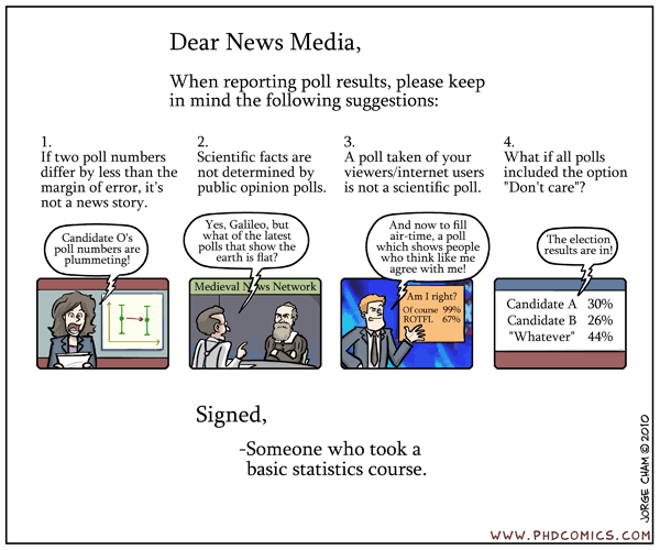
Except that studies like this are almost all misleading.

Several years ago, I read a pretty good book by Laura Vanderkam called 168 Hours: You have more time than you think.  It was through this book that I got introduced to the Bureau of Labor Statistics American Time Use Survey.

Now, most time use surveys....the type that people use to give reports about how much we sleep or work....are done by just asking people.  Now that's great, except that people are really terrible at reporting these things accurately.  The ATUS however, actually walks people through their day rather than just have them guess at a number.  It's interesting how profound these differences can be.  In another survey using time diary methodology, it was found that people claiming to work 60 - 64 hours per week actually averaged 44.2 hours of work.  More here, if you're interested.

Unsurprisingly, sleep is one area that people chronically underestimate how much they're getting.  The CDC study, which it admits was all data from calling up and asking people "how many hours of sleep do you get on average?" found that 30% of workers sleep fewer than 6 hours per night.  The ATUS however, finds that the average American sleeps 8.38 hours per night....and that's on weekday nights alone.  Weekends and holidays, we go up to 9.34.

I couldn't find the distribution for this chart, but I did find the age breakdown, so we can throw out those 15-24 and those over 65 (all of whom get about 9 hours of sleep/night).  We're left with those 25 - 65 who average roughly around 8.3 hours of sleep per night.

Alright, now lets check the CDC number and figure out how much sleep the other 70% of the population would have to be getting in order to make these two number work.

If we take some variables:
a = percent of people sleeping an average of fewer than 6 hours per night
x = the maximum number of hours to qualify as "fewer than 6 hours"
b = percent of people sleeping more than 6 hours per night
y = average amount they are sleeping to balance out the other group
c = average amount of sleep among workers according to the ATUS survey

We get this:  ax + by = c
And then substituting:  (0.3*5.9) + (0.7*y) = 8.3
Solving for y:  y = 9.33 hours of sleep per night

Are 70% of Americans of working age actually getting 9.33 hours of sleep per night?  That would be pretty impressive.  It would also mean that instead of a normal distribution of sleep hours, we'd actually have a bimodal distribution....which would be a little strange.

There is, of course, the caveat that those answering the ATUS represent the whole population while the CDC targeted working adults.  It's a little tough figuring out how profoundly this would affect the numbers since the BLS reports workforce participation rates for those 16 and up.  The unemployment rate for 2010 (the year the survey was completed) hovered just under 10%, but the "not in labor force" numbers are a little harder to get without skewing by the under 25 or over 65 crowd.  The CDC also didn't report an average, so I can't compare the two....but given the 30% number, the six 6 hours or less would be less than half a standard deviation from the mean (if the sleep data was roughly normal).

So does this mean I'm not as tired as I think I am?  Nope, I'm pretty sure I'm still going to bed early tonight. I will however, be aware that a tiring week does not necessarily mean a sleep deprived one.

Wednesday, May 2, 2012

Hey, at least someone's thinking

Best idea I've seen all day....people taking Congress to task for having no system for vetting scientific testimony.  (H/T to Maggie's Farm)

Apparently what sent them over the edge was when a scientist misquoted his own paper during testimony,  skewing his own research.  Yikes.

One of the authors website is here....haven't had time to look around much.

Tuesday, May 1, 2012

Everybody loves a (certain sort of) hypocrite

Last week I posted my annoyance at studies that put more work in to proving that substitute a potential proximal cause for the real issue without adequately proving that was a valid substitution.  At the time I was talking about food deserts, but today I found another great example.  A study that has gone viral links homophobic behavior with secret homosexual desires.

Now, when I first heard these results in passing, I was pretty surprised.  I spent years in a Baptist school with plenty of people who were quite clear about their homophobia, and I have always thought it overly simplistic when people say that's all repressed homosexuality.  I think the reasons behind any prejudice are likely to be complicated and multifaceted.  Plus, the logic seemed pretty sensationalistic.....and after all, we don't accuse misogynists of wanting to be women.

Anyway, I hadn't had time to look in to this study, but I ran across this takedown by Daniel Engber on Slate today.   I thoroughly enjoyed the article (and extra credit to Slate for not being 100% PC).  The author points out that the results of this study are only as trustworthy as the semantic association method (the implicit association test) they used to prove it.  This technique, which essentially involves showing a subliminal message followed by a picture, can be questionable.  From the Slate article:
Should we trust this interpretation of the data? In the Times op-ed, the authors claim that the reaction-time task "reliably distinguishes between self-identified straight individuals and those who self-identify as lesbian, gay or bisexual." Their formal write-up of the work for the Journal of Personality and Social Psychology is a bit less sanguine on the method, citing just one other study that has used this approach, and saying it "showed moderate correspondence with participants’ self-reported sexual orientation."
So there's that.

The other issue that Engber didn't mention is that this study was performed on college freshmen.  I REALLY hate when people generalize from that age group because....stop me if I'm getting crazy here...I am pretty sure kids that age have a less well developed sense of identity than the adult population at large.

Even if the data were 100% accurate, I think that the youngness of this sample would skew the results.  At least when I went to college, quite a few kids came out during that time, and it was a time of questioning  identity for pretty much anyone.  According to the best research I could find, the average gay person doesn't even self-identify as gay until 16, and the majority of people come out either in college or after developing an independent life.  So the chances that expressions of sexual identity, especially subconscious expressions, may look different at 18-20 is pretty well supported.

Now I'm pretty sure there will always be Ted Haggard's or Larry Craig's in this world...just like there will always be John Edwards or Elliot Spitzer's.  Sex, gay or straight, will always capture headlines more than boring things like tax evasion, even though they are both hypocritical.   Still, with studies like this, I urge caution. Accepting the result means accepting that words on a screen and hundreths of a second of reaction time can accurately capture homophobia, and that a 19 year olds perspective on the world can translate to all adults.  If you believe both of those, then go ahead and quote the study.  Otherwise, you may want to hold your judgement for a bit longer.